2 Chapter 2: Systems Thinking: a New Way to Tackle Problems
When President Theodore Roosevelt created the Grand Canyon National Game Preserve on November 28, 1906, he set aside the finest deer herd in America. But in doing so, he unintentionally wrote the first chapter of a harsh lesson whose impact is felt to this day in every deer management plan on the continent.
James B. Trefethen, 1967[1]
Your experience with managing the Kaibab mule deer population probably highlighted just how hard it is to make good decisions when navigating the pressures created by the hopes and expectations of stakeholders like the President, your boss, the American public, and yourself. When you add to those pressures the complex interactions that make up the ecosystem on the Kaibab plateau, you’ve got a recipe for disaster!
Why is that? It’s because that, on their own, human beings are not capable of anticipating the behavior of complex systems like the one you’ve just experienced (Forrester, 1961; Carranza & Rego, 1999; Arthanari, 2015). There is simply too much going on, and it can take a long time for our actions to play out. We can be deceived by short-term success, all the while unknowingly laying the groundwork for a long-term disaster (Eden, et al., 2009, Meadows, 2008).
If you saw the deer population eventually explode to unmanageable levels followed by a collapse due to significant degradation of the Kaibab forest, you should take comfort in knowing that this was the same experience of the people who were tasked with managing the Kaibab in the early 1900’s. They too found it difficult to get this big complex system of expectations and natural environmental forces to work together toward a desirable outcome. Their best-intentioned actions actually made things worse. Forest and wildlife managers in the region have continued to struggle with the aftermath of the crisis on the Kaibab up to the present time!
Now it’s time to take a fresh look at this problem. We’ll do so by asking you to figuratively put on a new set of glasses so you can see the Kaibab problem in a new light – as the product of an underlying system. To get us started, we first have to define what we mean by saying that something is a “system.”
2.1. What does it mean to call something a “system?”
A system[footnote]See Ford (2019) for a definitive glossary of system dynamics terms.[/footnote] is a collection of interconnected things that together operate toward a certain end (Ackoff, 1994, Meadows, 2008). For example, your body is a system. It’s a collection of organs (heart, lungs, stomach, brain, etc.) that work together to keep you alive and healthy. While distinct from one another, the parts of your body are not independent. Some parts could exist “on their own” (at least for a while), but they have also evolved to be highly interdependent. In systems lingo, we say that your body’s organs are tightly coupled to one another. If one part is injured or removed, the entire body must somehow compensate. Studying the body’s organs in isolation may be useful and necessary, but to understand how the body works, we need to know more than how the individual parts work. We must also describe how those parts work together, and to what ends they work together. We need to study the body as a system.
Just like your body, the Kaibab Plateau is comprised of many different interacting parts (Ford, 2009). Instead of working within the confines of your body, the elements in the Kaibab system operate across a wide variety of scales of time and space. The Kaibab system includes populations of living organisms like mule deer, mountain lions, cattle, and various types of plants. This system also includes physical resources (such as soil, air, and water). To make things even more complicated, this system involves political, economic and social forces that shape the way humans interact with the Kaibab through activities like hunting, ranching, or recreation.
All of these elements of the Kaibab system depend on and affect each other in a kind of give-and-take dance. The animals depend on each other and on the plants for survival. In turn, the plants depend on the work of animals to break up and fertilize the soil as they move across the landscape. The plants depend on the soil, water, and sunshine, but they also impact these things by creating shade that reduces the rate at which water evaporates from the soil. Human activity depends on all of these things working well together. And, of course, humans do things that impact the overall health of the natural ecosystem in both positive and negative ways.
Because of this constant give-and-take dance between all of the components of the system, the status of the system is dynamic (Roberts et al., 1983). That is, the system status is constantly changing. It may not seem that way when you look at family vacation photos from the Kaibab. That’s because many of the changes in this system take days, months, years, or even centuries to play out, and photos capture only a single moment in the life of that dynamic system (Richardson and Pugh, 1985).
This means that problems like the one you’ve encountered on the Kaibab involve dynamic systems – systems that constantly change over time. In order to figure out how to address problems like the Kaibab challenge, we have to develop skills at working with these kinds of systems (Morecroft, 2007).
In the following sections, you will learn how to use three important systems thinking practices to help you start “seeing the system beneath the problem.” These three practices are listed below.
Three Systems Thinkng Practices
- Evaluating behavior over time
- Looking for feedback loops
- Identifying key stocks and flows
2.2 Seeing the System Beneath: Evaluating behavior over time
In order to combat the common mistakes caused by event-oriented thinking, systems thinkers practice a simple, yet wholly different approach to describing problems. They describe them in terms evolving behavior over time (Sterman 2000; Richardson and Pugh, 1981). This means that, rather than thinking of the problem only in terms of the current state of affairs, or as something caused by someone or an event in the recent past, systems thinkers describe problems in terms of their long-term history.
One of the most powerful tools for doing this is the behavior over time graph (BOTG). A BOTG is a plot with time on the X-axis and with one or more measures of problem severity on the Y-axis. Such a graph reveals the evolutionary history of the problem (Kim, 1998). It shows periods when the problem was getting worse and periods when it was improving. It helps us to evaluate whether the problem is a recent development or something that has been building over time. It also gives us a sense of how far back in time we need to go in order to understand the roots of the problem.
2.2.2 How to Create a BOTG
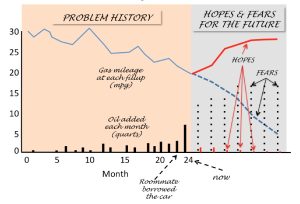
A BOTG is made by plotting the time trajectory of a few carefully-chosen variables. These variables are chosen so as to give a reasonable picture of the status of the system at any given point in time. For example, with your friend’s car, it might be reasonable for them to keep track of some important indicators of the car’s mechanical performance. Given that they seem to be worried about oil usage, it makes sense that they would plot the number of quarts of oil added each month. They might also plot something like their car’s gas mileage every time they fill up. Notice these two variables are not chosen in order to identify the causes of the problem. They are chosen to show the status of the system (i.e., the car) over time. By looking at a plot of these two variables over time, your friend might get an idea of whether the problem is a recent thing, or something that has been going on for a while (Randers, 1980).
The BOTG gives a more complete picture of what’s going on. It shifts our attention from thinking exclusively in terms immediate causes (“My roommate messed up my car”) and opens us up to considering if there is a deeper, ongoing system that creates the time trajectory in the BOTG. If there is, then we can focus on understanding that system. Then we can diagnose the real causes of the problem. This gives us a much better chance of finding effective ways to intervene. Let’s suppose that your friend has made such a graph, and it looks like the BOTG in Figure 2.1.
Care milage and oil use
What does the BOTG for your friend’s car problem suggest? It appears that the problem with the car didn’t “just happen” when the roommate borrowed it. Instead, the graph shows that the car has exhibited increasing oil usage and deteriorating gas mileage for at least the last 15-20 months. The problem existed long before the roommate borrowed the car.
Now it’s time for you to get some practice making a BOTG. As you do this, make sure you follow the following best practices.
Best Practices for Making a BOTG
- Always put TIME on the X-axis.
- On the Y-axis, plot 1-3 quantities whose collective values give a sense of the problem status over time. Note, you can do this on individual graphs for purposes of clarity.
- Clearly label all curves and state their units of measurement.
- Clearly label all axes with a scale.
- Show both the HISTORY of the problem, as well as your HOPES and FEARS for how the future might unfold.
- Where appropriate, annotate the graph with points in time representing significant events or changes in policy that are relevant to the problem.
2.2.3 Augmenting the BOTG to set goals tell a story about the problem
As you’ve seen with the example about your friend’s car, the BOTG is an incredibly powerful tool to help you begin to use systems thinking when tackling a problem.
You can also use the BOTG to help your team think through your goals when tackling a problem involving a complex system. In particular, the part of the graph showing the “hopes and fears” implicitly identifies what kind of future trajectory you’d like to avoid and what you’d hope to see if your team’s work is successful.
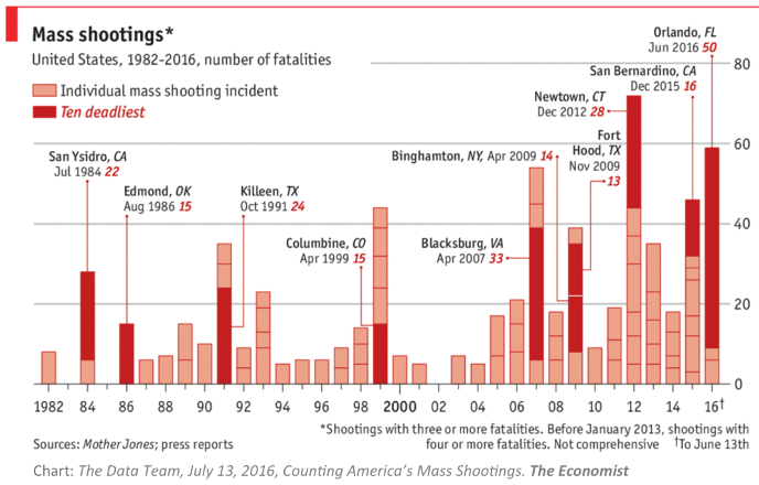
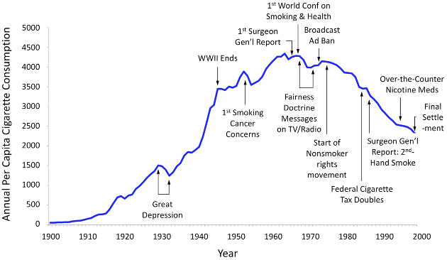
Finally, the BOTG can be a visual aid to help you “tell the story” about the length of time over which the problem has developed and whether the problem just appeared “out of the blue” or whether it was the “tip of the iceberg” involving something deeper. The BOTG forces you to ask, “What is going on here?” It encourages you and your team to start thinking about the system underneath it all, and how that system creates the behavior you see in the graph. See, for example, the annotated BOTGs in Figures 2.2 and 2.3 show time trends of two very different problems in the U.S.: mass shootings, and per capita cigarette consumption. Each of these graphs tells a powerful story about the problem. Figure 2.1 highlights the recent trend toward ever more frequent mass shootings and toward greater numbers of fatalities over the past. Figure 2.2 highlights the progress made from 1950 through 1995 in reducing cigarette consumption (and its related health effects.
Exercise 2.1: Modeling Challenge – Describing a Systems Problem in the News
- Find a news article describing a current problem that you think may be caused by some underlying dynamic system. Write up a 1-page description, plus an extra page with a BOTG. Make sure you include the following in your writeup.
- A full reference to the article: Author (date), article title, publication or sponsoring organization, and website (if online).
- A brief description of the problem.
- A list of some of the more important “pieces” of the system. Think about any actors or forces from nature (apart from humans), the human institutions or decision makers that have authority to impact the problem, and the stakeholders (people who are affected by the problem, but who may or may not be in a position to change things).
- A brief written description of the “system dance” – the ways these parts of the system interact to affect and be affected by each other. Your description need not be lengthy. See the description above as an example of how to do this.
- A BOTG showing the evolution of the problem over time. Make sure you label the time axis, showing the actual time scale. On the Y-axis, show one quantity that allows you to track the status of the problem over time. Annotate the graph with important events that are relevant to the problem. See if you can find real data for making your BOTG. Annotate the graph, as appropriate, to mark important actions, events, or policies that are relevant. Sketch into the graph what you think are someone’s hopes and fears for this problem in the future.
2.3. Seeing the System Beneath: Looking for feedback loops
By thinking about behavior over time and displaying that behavior in a BOTG, system modelers turn their attention to the underlying system driving that behavior. One important way of examining the system is by looking for feedback loops. A feedback loop is a circular chain of cause-effect relationships that creates a powerful force affecting how a system behaves (Roberts, 1978a; Richardsonm 1999; Ackermann et al., 2000; Arthanari, 2015) (Proceedings of the 27th International Conference of the System Dynamics Society, 2009) and (Carranza & Rego, 1999).
Feedback loops are extremely important in any dynamic system. In fact, it’s because of feedback loops that the sun keeps shining, rain keeps falling, and ecosystems continue to function. Feedback loops keep governments in power, and they fuel war. It’s also because of feedback loops that an ocean fishery or a human society might collapse (Travis et al., 2014; Moxnes, 2010; Bueno, 2011).
Feedback loops are primal forces that dictate the behavior of systems like the one you’ve just experienced on the Kaibab plateau. Such systems involve an interplay ― a give-and-take ― between humans, natural laws, and the struggle for survival among plants and animals. These circular chains of cause and effect exist because your actions are not independent of the other actors in the system (the stakeholders, animals, and plants). When you act, they respond, and their actions “work back” to impact your future actions ― a circle of cause and effect (see Figure 2.4).
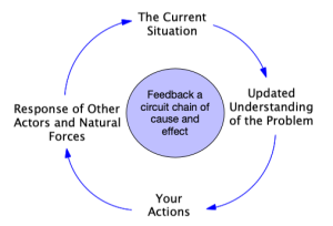
These feedback dynamics are extremely powerful, but they often work under our radar. This can happen because some feedback forces take a long time to gain momentum and exert their influence. Or, we may simply be blind to other actors in the system and how our actions interact with theirs.
Recognizing the presence of feedback and learning how to identify it, describe it, and explore its role is central to your ability to understand the roots of the problem and the behavior of the overall system. The goal is to ultimately reach a point of understanding where you can more reliably predict how the future might unfold, and thereby adjust your actions with an eye on the big picture, always watching the “long game” – the long-term consequences of your actions.
2.3.1. The Causal Loop Diagram. A tool for drawing and examining feedback

One of the tools that systems thinkers use to look for feedback loops is the causal loop diagram (or CLD). These diagrams provide a powerful visual tool for scoping out the feedback structure in a problem. They are also useful as storytelling devices for explaining to others how the system and its accompanying feedback work to create the problem (Stroh, 2015).
Figure 2.5 shows an example of a causal loop diagram. The named quantities in the CLD represent system characteristics or variables that can change in value in response to one another. These variables represent characteristics of the system that can increase or decrease over time.
4 Rules for CLD Variable Names
Each variable name must …
- Be a noun or noun phrase.
- Name something that is relevant to the problem.
- Identify something that can be thought to increase or decrease over time.
- Be something for which the meaning of “increase” or “decrease” is unambiguous.
Important: Do not restrict yourself to variables that can be easily measured. Instead, think of those things that are relevant to the problem, even if they are difficult (or impossible) to directly measure.
The curved arrows are causal links that show the direction of causal influence. For example, the arrow from Deer Population to Deer Births implies that changes in the size of the deer population cause changes in the number of deer born each year. The “+” and “-” labels on the arrows are causal link polarities that indicate how the cause-effect relationship works.
- A “+” polarity means that changes in the causal variable will cause the affected variable to move in the same direction. This means that, if the causal variable were to increase, that would cause the affected variable to be higher than it would have been without the change. Conversely, if the causal variable decreases in value, the affected variable will be lower than it would have been without the change. For example, if the Deer Births per Year were to increase, then the Deer Population would be higher than it would have been without that change. This is why there is a causal link with “+” polarity running from Deer Births per Year to Deer Population.
- A “-” polarity means that any changes in the causal variable will cause the affected variable to move in the opposite direction. Hence if the causal variable were to increase, then the affected variable would be lower than it would have been otherwise. Conversely, if the causal variable decreases in value, the affected variable will be higher than it would have been otherwise[2]. For example, if the Deer Deaths per Year were to increase, this would cause the Deer Population to be lower than it would have been without that change (See Richardson, 2001 for a fuller explanation). Hence, there is a causal link with “-” polarity running from Deer Deaths per Year to Deer Population.
Exercise 2.2: Modeling Challenge – Using appropriate variable names in a CLD
At least one of the variable names in each example below does not follow the 4 Rules for CLD Variable Names given earlier. For each example, revise the names of one or both variables to correct them. Then assign polarities to the causal links in each diagram.
2.3.2 Using the CLD to Explore Two Types of Feedback
The CLD in Figure 4 shows two circular chains of cause and effect, corresponding to two different feedback loops. One loop involves the circular cause/effect relationship between the Deer Population and the Deer Births per Year. The other feedback loop involves a circular cause/effect relationship between the Deer Population and the Deer Deaths per Year.
These two feedback loops represent the two different types of feedback that exist in complex systems: balancing feedback and reinforcing feedback.
2.3.3. Balancing Feedback – The Constraining Force Against Runaway Behavior
In Figure 4, the feedback loop involving the Deer Population and Deer Deaths per Year is an example of balancing feedback. To see why this name makes sense, imagine what would happen if the Deer Population were to increase. This would result in more Deer Deaths per Year (as per the causal link with “+” polarity from the Deer Population to Deer Deaths per Year). But, if the number of deaths goes up, those increased deaths will cause the population to be lower than it would have been otherwise (note the “-” polarity on the link pointing from Deer Deaths per Year to Deer Population). We mark balancing feedback loops with symbol ![]() (called the loop polarity). The direction of the circular arrow provides a visual clue to the direction of the causal flow around the loop.
(called the loop polarity). The direction of the circular arrow provides a visual clue to the direction of the causal flow around the loop.
The balancing feedback loop works to counteract or balance the original increase in Deer Population. You can see evidence of balancing feedback at  work when the time BOTG shows progress toward some sort of level condition (called an equilibrium level or a steady state). Also, if a BOTG shows an oscillating behavior around an equilibrium point, that is also an indication that a balancing feedback force is in effect. Imagine a marble in the bottom of a bowl. If the marble is moved away from its resting place at the bottom of the bowl, the force of gravity and the walls of the bowl work together to eventually force the marble back toward the center. That’s what balancing feedback does. It serves as a kind of “magnet,” trying to pull the system back to some sort of equilibrium.
Another way of saying this is that balancing feedback creates goal-seeking behavior. It works to push the system toward some sort of stable goal. Sometimes the “goal” represents a target consciously chosen by someone who wants to push and maintain the system at that level. For example, with the Kaibab deer, you had a goal of helping the deer population grow to a level around 30-40 thousand deer and then remain steady there. Your actions and responses to the year-by-year reports comprised a balancing feedback loop that worked to push the system toward this goal.
Other times, the “goal” of a balancing feedback loop may not be consciously chosen by anyone, but it may instead be a consequence of natural laws or constraints that determine where the system is most stable. With the Kaibab deer, the natural resources on the Kaibab, the weather, soil, etc. all combine to dictate how many deer the system can sustain in the long term. That sustainable number is called a “carrying capacity” of the ecosystem. It’s not chosen by any person. It’s a product of the natural forces of nature, and the ecosystem will work to “control” the deer population to that level.
Notice that we’ve identified two different goals for the Kaibab deer population: (1) your goal of 30-40 thousand deer, and (2) nature’s goal population size based on the natural carrying capacity. These two goals are not necessarily the same. Which goal will the system move toward? Which balancing feedback loop will ultimately “win?” In the case of the Kaibab deer population, the answer to this question really depends on how much influence you actually have, compared to the influence that nature exerts. Of course, nature usually wins! The problem with predicting the exact outcome is that the way nature exerts its influence might be different than what you expect. Your actions to control the deer population to 30-40 thousand deer may impact the ecosystem in ways that change the natural carrying capacity. It may degrade to some lower value ― especially if you push the system to have so many deer that they over-consume the natural resources on the Kaibab!
2.3.4. Reinforcing Feedback – The Engine of Accelerating Growth
And this is only half of the story! There’s yet another kind of feedback at work in complex systems: reinforcing feedback. You can see an example of this kind of feedback in the other circular causal chain in Figure 2.5. Notice that there is a feedback loop running from Deer Population toward Deer Births per Year, and then back to Deer Population. As the Deer Population increases, this causes the Deer Births per Year to also be higher, which in turn causes the Deer Population to increase even more.

This is a reinforcing feedback loop because it reinforces movement away from any stable condition and builds momentum toward even more change in the same direction. Reinforcing feedback creates a snowball effect that builds faster and faster movement away from equilibrium. Left unchecked, the reinforcing feedback in Figure 2.5 would push the Deer Population toward ever faster growth and would eventually cover the planet with mule deer! We label reinforcing feedback loops with the symbol ![]() , as in the figure. The circular arrow shows the direction of causal flow around the loop.
, as in the figure. The circular arrow shows the direction of causal flow around the loop.
Feedback loops can be more complicated than the simple two-variable examples just discussed. For example, Figure 2.6 adds a new feedback loop to the earlier one. This new feedback is highlighted with bold arrows to make it easier to see. The next Action Item gives you a chance to explore this feedback loop.
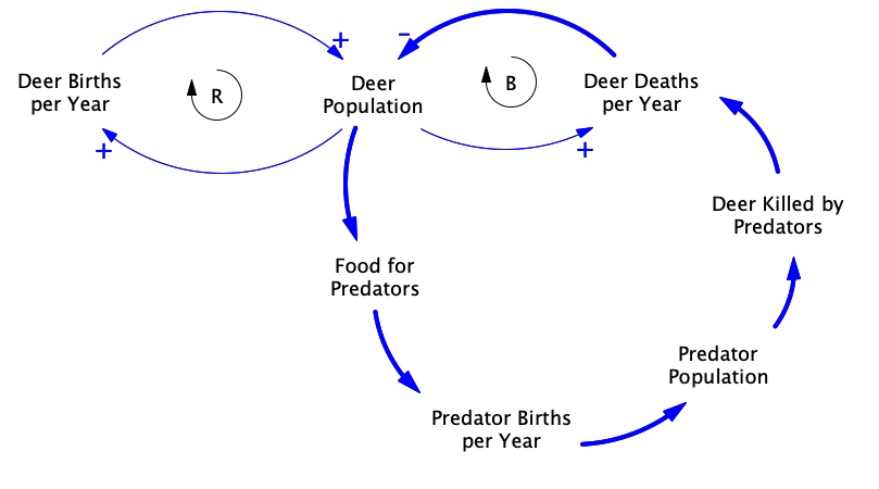
Exercise 2.3: Modeling Challenge – Exploring More Feedback Loops on the Kaibab Plateau
- Look at the new feedback loop in Figure 2.6.
- Assign + or – polarities to each of the causal links in this feedback loop.
- Which type of feedback is this? Balancing or reinforcing? (Hint: Start with any variable in the loop. Imagine an increase in that variable. Then follow the causal links around the loop, determining whether each variable increases or decreases, according to the link polarity. Once you return to the starting place, if the original variable moves in the same direction as at first, you have reinforcing feedback. If it moves in the opposite direction, you have balancing feedback loop.)
- Create a “story” that explains how this feedback loop affects the welfare of the Kaibab deer population. Your story needs to be only one or two sentences long.
- How does this feedback loop fit into the overall system in the diagram? That is, given that there are three feedback loops in the system, what is the role of each loop in affecting the welfare of the Kaibab deer? Of the predators?
- Recall that the deer depend on forage for food. Add to the CLD in Figure 2.6 the variables listed below and create two new feedback loops: (1) a balancing loop showing how the deer population is constrained by its food supply, and (2) a reinforcing loop showing exponential growth of the forage, (the more forage there is, the more forage growth there is). Make sure you label all causal links with their polarities. Use circular R and B symbols to indicate the new feedback loops.
- Forage available
- Forage growth
2.3.5 Competing Feedback Loops
Searching for feedback loops is a powerful way of looking at a problem. Instead of thinking about isolated cause/effect relationships, or looking for a single cause of a problem, we now focus our attention on the interactions between multiple factors. And those interactions show up as a contest between competing forces ― reinforcing and balancing feedback loops. Some loops work to push the system toward unfettered growth, while others try and push the system toward some sort of equilibrium. For a while, one particular feedback loop may dominate the behavior of the system. Later, things may change so that a different feedback loop begins to assert its influence and dictate how things play out.
You can often see evidence of this tug-of-war between balancing and reinforcing feedback by examining the BOTG for your problem. Reinforcing feedback creates rapid, exponential growth, while balancing feedback creates movement toward some sort of equilibrium (either a “flat line” equilibrium or oscillation around an equilibrium).
For example, imagine that there was an abundant food supply for the Kaibab deer and very few predators. Under those conditions, we’d expect the reinforcing feedback loop in Figure 5 (Deer Population ↔ Deer Births per Year) to dominate the system. The deer would flourish, produce offspring, and grow rapidly. Of course, the deer population would eventually get so large that there would be too many deer for the ecosystem to support them. At that point, more deer would starve and deaths would mount. During that period, other feedback loops would begin to dominate the system, pushing the Deer Population back toward some sort of equilibrium.
Exercise 2.4: Modeling Challenge – A Tug-of-War Between Feedback Loops
- Below are five different BOTG’s from an imaginary system. In each graph, either balancing or reinforcing feedback is dominating the system behavior. Which type of feedback is dominating in each case?

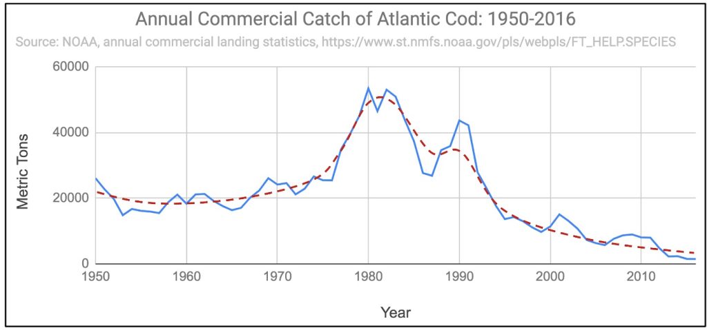
- Below is a BOTG showing the annual catch of Atlantic Cod from 1950 through 2016. For the purpose of this exercise, you can ignore short-term fluctuations. Instead, focus on the long-term trend, as indicated by the dashed trendline superimposed on the graph. According to that trend, during the early stages of this history, one type of feedback has dominated the system’s behavior. In the later stages, a different type of feedback has dominated. Mark on the graph the approximate time period during which each type of feedback dominates this system’s behavior.
- Look at the CLD involving the deer population. Predator poulation and the amount of forage that you created earlier. Notice all of the feedback loops in that system. Which feedback loop(s) do you think would dominate this system early on when there is plenty of forage and a relatively small number of deer. Which would dominate later as the deer population grows and the forage is consumed?
- Get together with your team and look over the BOTG you made from the Kaibab challenge. See if you can identify time periods in which balancing feedback was dominating the system and periods in which reinforcing feedback was dominating.
2.3.6. Using Causal Loop Diagrams – Identifying Polarity in Feedback Loops
In this section you will get some more practice in reading and interpreting causal loop diagrams. The goal is for you to become proficient in assigning polarities to causal links and in finding feedback loops in the system. The causal loop diagrams in the Modeling Challenge below represent the mental models of the authors. You should feel comfortable changing the variable names or adding intervening variables that represent your mental models. Also, for significant delays in the system, you can add a hash mark.
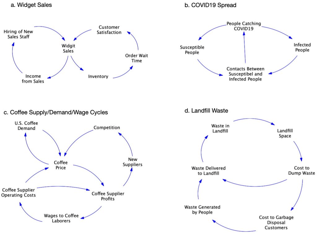
Exercise 2.5 Modeling Challenge – CLD Practice – Link Polarities and Feedback Loops
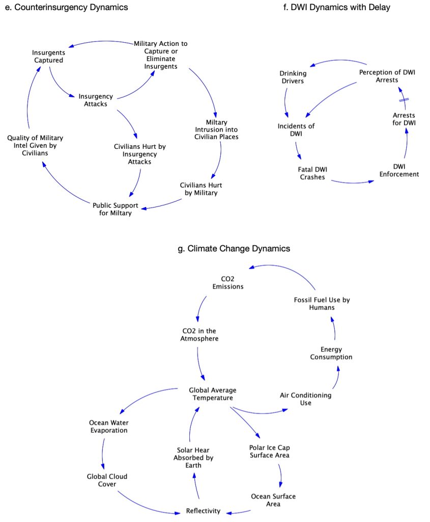
Below are several causal loop diagrams representing common systems. For each diagram, do the following:
- Label all causal links with the appropriate + or ― polarity.
- Identify all the feedback loops in the CLD. Label each with a
 or
or  identifier to indicate if the loop is balancing or reinforcing.
 - Give a descriptive name to each feedback loops.
Exercise 2.6: Modeling Challenge – CLD Practice – Link Polarities and Feedback Loops Continued
2.3.7. More Practice with Causal Loop Diagrams – Telling Systems Stories
Everyone loves a good story. In fact, stories are one of the most powerful tools we have for exploring complex ideas involving multiple characters and competing interests. Think about the series of Star Wars movies. These have spawned a whole line of books, a religious movement (“May the force be with you!”), and several acting careers. Such is the power of stories.
When trying to understand how a feedback-rich system impacts a problem like the collapse of a deer population, or the spread of an infectious disease the use of stories is one of the best strategies a systems thinker can use. Every story has one or more main characters. In the case of a system story, the main characters are those feedback loops that you believe are important to the problem. Think of a system story as something like a crime mystery. A crime has been committed, and the detective has to figure out who did it and how. In the case of a system story, the “crime” is represented by the BOTG. That graph shows the evolution of a undesirable situation. That time trajectory is the “crime.” We also know that the crime was not committed by a single actor, but instead by a collection of actors working together.
Who are the actors? The feedback loops in the system comprise the “crime syndicate” that has created the problem in the BOTG. You, the system modeler, have to figure out just how those feedback loops have conspired to bring about this undesirable situation.
So, a system story is a story about what you consider to be the important feedback loops impacting the problem. The purpose of the story is to explain just how those feedback loops have worked (sometimes in competition with one another; sometimes in concert) to bring about the situation we see in the BOTG.
To illustrate how this works, consider the imaginary case study introduced in the box that follows[3].
Storytelling Case Study: A Housing Crisis in San Fransokyo
The Problem
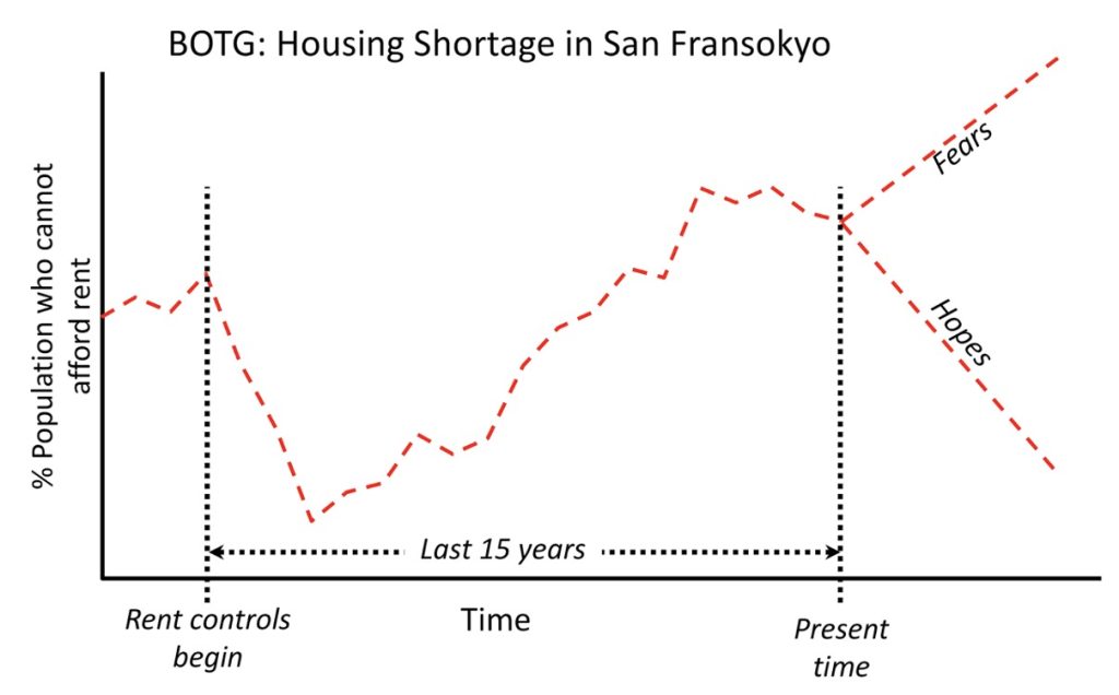
Fifteen years ago, the city of San Fransokyo instituted a system of rent price controls in order to cap runaway apartment rental costs and thereby enable more people in the city to find housing they could afford. Unfortunately, the city is now experiencing a record housing shortage. This shortage is created in part by rapid growth of the city’s population. This has occurred during the period when the rent control policy has been in effect. See the BOTG for a picture of the problem over the past 15 years.
In addition, the city’s Housing Authority that oversees the program has received numerous complaints of corruption among landlords who are reportedly demanding under-the-table bribes (“key money”) from people who want to rent their apartments. Landlords are able to demand these bribes because of the burgeoning population and growing housing shortage in the city.
If the roots of these problems are not corrected, it will be harder and harder for middle- or lower-income families to afford adequate housing.
City officials believe that the rent control policy can work. In fact, as the above issues have developed, the Housing Authority has continued to hold the line on rent price caps…sometimes even reducing caps further, in hopes of helping more people find affordable housing. City officials believe that these extraneous developments (population growth, corruption, etc.) have gotten in the way of what would otherwise be an effective policy, and they are looking for a solution. They think that perhaps the corrupt landlords simply need to be prosecuted and put in jail.
Initial Analysis – A Causal Loop Diagram
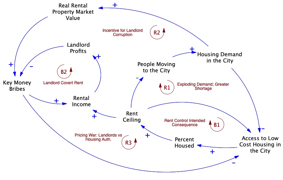
The Housing Authority has hired a team of systems modeling consultants to study this problem and make recommendations. This team has done some research and created a causal loop diagram to identify the feedback forces impacting this problem. That diagram is shown below.
Of course, a diagram like this has little meaning to decision makers who have no experience with systems thinking. Hence, the team has also written a system story to explain how the research team thinks that this feedback structure has contributed to the problem.
Causal Loop Diagram – Preliminary Analysis of Important Feedback Dynamics
System Story – An Explanation of the Feedback Structure in the CLD
Rent price controls (or “Rent Ceiling”) were instituted 15 years ago by the Housing Authority in response to a severe shortage of affordable rental housing in the city. This is evident in the BOTG by the high percentage of people who could not afford rent before the controls were instituted. The rationale was that imposing a maximum allowable rent (Rent Ceiling) would make housing affordable to more people and bring the problem under control. See the balancing feedback loop B1 (“Rent Control Intended Consequence”). This feedback is balancing because it acts to restore the problem to a lower, manageable level. This is what happened in the first few years of the policy.
However, this policy set in motion several other forces that actually undercut the original goals of the Housing Authority. These forces are represented in the CLD by the feedback loops R1-R3 and B2. Loop R1 (Exploding Demand) represents the effect that the policy had on the city population. People rushed to the city to take advantage of the now lower rents. This only exacerbated the housing shortage, prompting the Housing Authority to lower the Rent Ceiling even further, which in turn attracted even more people to the city ― a snowball effect.
The R2 loop (Incentive for Landlord Corruption) and R3 loop (Pricing War) together explain the runaway pricing war and increasing shortage that was created by the combination of the rent control policy and the desire of landlords to earn an income commensurate with the true market value of their properties. In the R2 loop, the lower Rent Ceiling and influx of people effectively raised the real market value of the rental properties in the city. But the landlords could not capture that value because of the Rent Ceiling. Hence, they turned to demanding under-the-table “Key Money” bribes, effectively pricing their apartments beyond the reach of many people. In response, the Housing Authority continued to lower the Rent Ceiling, without understanding that this simply reduced the landlord income (Rental Income) and motivated more corruption and Key Money Bribes (B2 ― Landlord: Covert Rent).
Hence, the use of price controls appears to have had the opposite effect of what was intended (Forrester, 1971). This is our current hypothesis for what has caused this problem. We will evaluate it more fully once we develop a running simulator.
Features of a Good Systems Story
- The primary audience is the client or decision-maker who has asked you to work on the problem.
- It is designed to explain how the system structure (i.e. the feedback loops in the CLD) contributes to the problem shown in the BOTG.
- It does this by explaining the roles of the feedback loops in affecting the problem.
Exercise 2.7: Modeling Challenge – Practice with System Storytelling
Instructions
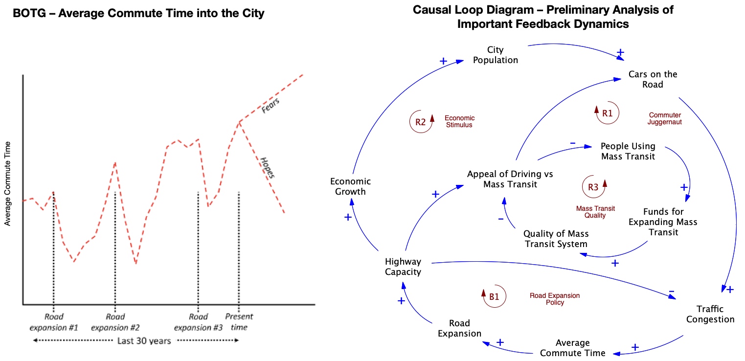
This action item gives you practice creating your own system story for a problem. Imagine that you have been hired by the director of the transportation department in your city to address the problem described below. After sufficient research, you have developed the CLD provided after the problem description[4]. Write a brief system story to explain how the feedback structure in the CLD has contributed to the problem. As you do this, pay attention to the above features of a good system story.
The Problem
Your city has experienced dramatic growth over the past few decades. This has led to much more traffic, and longer commute times for people working in the city. In response to this, the city’s department of transportation has launched several road expansion projects over the past 30 years to increase the number of lanes on important roads, and to create a new beltway by which commuters can quickly come to work.
Unfortunately, these changes appear to have been “too little, too late.” As the road system has expanded, the traffic congestion has gotten even worse. This is evident in the BOTG graph below showing the average commute time for people working in the city. In addition, fewer and fewer people are commuting on the mass transit system (buses, trains, subway), making matters worse on the roads.
The CLD shows the feedback loops you’ve identified in your initial analysis of the problem.
2.4. Seeing the System Beneath: Identifying Stocks and Flows
It’s fairly easy to think about how a simple system involving only one or two feedback loops might behave over time. What if we were faced with a system involving three, four…or many more feedback loops. In order to understand how things actually work in such a system, we have to build computer models that give life to these feedback loops and that help us explore how things might play out. We’ll start working toward this goal by applying the third practice used by system modelers: Looking for stocks and flows.
You’ve hopefully seen that feedback loops have a huge impact on the behavior of complex systems. The reason feedback loops exert so much power is because they represent the forces that affect how important populations and resources in the system change over time.
System modelers use stocks to represent these critical populations and resources. Stocks refer to quantities in the system that accumulate (or deplete) over time and Flows are those processes by which the accumulation or depletion occurs. The purpose of this section is to introduce the concept of stocks and flows and to help you learn to identify those stocks and flows that are important to the problem at hand.
2.4.1. Introducing Stocks and Flows
Think of a stock as the collection of all of a particular population or resource pool that is currently available in the system. The “contents” or size of the population or resource in the stock can accumulate or be drained over time. This happens through the flows of material, animals, etc. into or out of the stock.
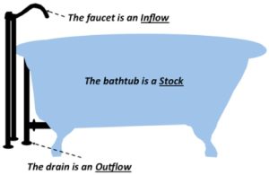
One way to visualize the concept of a stock and its flows is to think of a bathtub of water with a faucet feeding water into it and with a drain through which water is removed (Figure 2.9). In this figure, the bathtub is the stock of water in the system. The faucet is a flow of water into the system (i.e. an inflow). The drain is a flow of water out of the system (i.e. an outflow). If only the faucet is open and operating, then the water level in the tub will rise according to the rate of inflow through the faucet. If only the drain is open and operating, then water flows out of the tub, while none is being added. Then the water level will drop according to the rate of outflow through the drain. If both the faucet and the drain are open so that water is simultaneously flowing in through the faucet and out through the drain, the net difference between the inflow and outflow rates will determine if the water level in the tub rises or falls.
2.4.2. Stock and Flow Diagrams: Visually Showing Stocks and their Flows
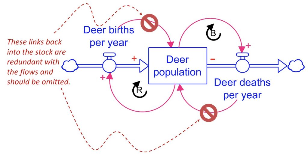
Let’s now apply the idea of stocks and flows to show how this changes the way we visualize and think about the feedback structure in a causal loop diagram. Figure 2.10 shows a causal loop diagram, along with a corresponding diagram using stocks and flows. These two diagrams are, for our purposes, equivalent, but the stock and flow diagram emphasizes which part of the system is a critical accumulating resource (the Deer Population).
The Deer Population is shown as a rectangle, designating it as a stock (i.e. as the collection of all the deer on the Kaibab). The Deer Births per Year is shown as a flow, symbolized as a pipe with a valve (i.e. ![]() ) flowing into the stock. That is, the Deer Births per Year is an inflow: it adds deer to the population. The Deer Deaths per Year is also shown as a flow, but it points out of the stock because it removes deer from the population. Hence, the Deer Deaths per Year is an outflow. The two causal links and their polarities pointing from the stock to the two flows have the same meaning as in the original CLD in Figure 4. That is, each link tells us that the the stock affects the two flows with a + polarity: an increase in the Deer Population causes a corresponding increase in each of the flows.
) flowing into the stock. That is, the Deer Births per Year is an inflow: it adds deer to the population. The Deer Deaths per Year is also shown as a flow, but it points out of the stock because it removes deer from the population. Hence, the Deer Deaths per Year is an outflow. The two causal links and their polarities pointing from the stock to the two flows have the same meaning as in the original CLD in Figure 4. That is, each link tells us that the the stock affects the two flows with a + polarity: an increase in the Deer Population causes a corresponding increase in each of the flows.

The diagram in Figure 2.10 is called a stock and flow diagram. Stock and flow diagrams[5] give a more complete picture of the system structure than what we see in a simple causal loop diagram like the left side of Figure 2.10. Stock and flow diagrams also provide the basic building blocks for creating working simulators that you can use to explore the problem.
Notice that the right side diagram in Figure 2.10 also shows the same two feedback loops as in the original CLD. But something doesn’t seem right. In the original CLD, there are two additional causal links: one running from the Deer Births per Year into the Deer Population and another from the Deer Deaths per Year into the Deer Population. Why don’t we see those same causal links in the stock and flow version of that diagram? The reason for this is because those causal links are already implied by the presence of the flows themselves. That is, including the links in the stock and flow diagram would be redundant. In order to more explicitly emphasize that the flows do in fact have a causal influence on the flow, we attached polarities to those flows to indicate the type of influence. See Figure 2.11.
A Word About the Clouds
You’ve probably noticed that each of the flows in a stock and flow diagram have cloud symbols attached to them. These clouds represent boundaries where the detail of our model stops. For example, the cloud on the Deer Births per Year indicates that we are not worried about the specific way that newborn deer are created — only that they are created at some rate. In the same way, the cloud attached to the Deer Deaths per Year indicates that we are not worried about where dead deer go only that deer do die at a certain rate. In her famous text, Thinking in Systems: A Primer, Donella Meadows refers to the cloud attached to an inflow as a “source” and the cloud attached to an outflow as a “sink.” This terminology makes intuitive sense, as the inflow cloud represents some unspecified (and limitless) source of the material, deer, etc. that are added to the stock. The outflow cloud represents an unspecified (and limitless) repository into which material, deer, etc go when they leave the stock.
Exercise 2.8: Team Modeling Activity – Stocks and Flows All Around!
Once you understand the idea of stocks and flows, you can find them everywhere! Below are listed several examples of stocks. Draw a separate stock and flow diagram for each example. Each diagram should have a single stock and the flows that are identified in the description. Some of these stocks can have only one flow; others have more than two flows! Give meaningful names to the stocks and the flows in your diagrams. Add ONLY ONE causal link that you think exists between each stock and one of its flows. Label the link with its polarity. Identify the resulting feedback loop that is created and label it with R or B notation. Also, make sure you don’t include redundant links pointing from the flows back into the stock (as in Figure 2.11).
- Your savings account is a stock of money. Your deposits add to the account. Your spending takes money away. Interest also adds money
- The amount of support for a river cleanup program in your town is a stock of people who are active in the program. This stock grows when people join the program. It reduces when people exit the program.
- The population of electric vehicles on the road is a stock of electric cars. Electric car purchases will add EV’s to the road. Accidents will remove them from the road.
- The amount of carbon in the atmosphere is a stock of carbon mass[6]. Carbon emissions from fossil fuel use adds to the atmospheric carbon. Carbon is removed by plants through photosynthesis. It’s also removed by absorption into the ground and oceans.
2.4.3. Specifying Units for Measuring Stocks and Flows
Units for Measuring Stocks
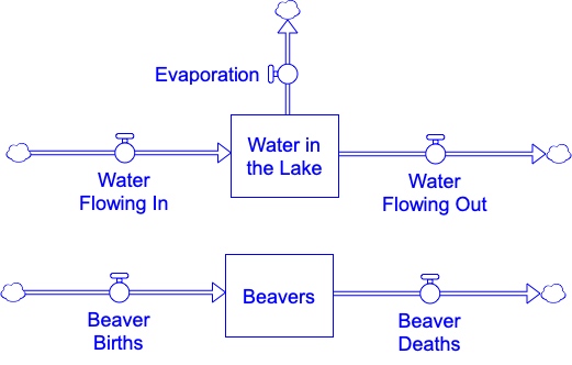
In a system dynamics simulator, the stocks and flows have numeric values that specify their status. These values can change over time as the system evolves. At any point in time, the numeric value associated with a stock specifies how much “stuff” is contained in the stock at that moment. The nature of the “stuff” depends on what the stock represents. For example, a stock of deer contains deer. A stock of water in a lake contains water. At any point in time, the numeric value of these stocks tells us how many deer or how much water is in the stock. For example, Figure 2.12 shows two stocks and several flows associated with a lake and a population of beavers that live around it. During a simulation run, the contents of the Water in the Lake stock will be a expressed as a numeric value that specifies how much water is in the lake at each moment. This value will change as the simulation progresses. But a numeric value (like, say, 50,000) has no meaning unless we know the units in which that value is expressed. Do we mean 50,000 ounces of water? 50,000 gallons? 50,000 cubic meters? 50,000 liters? What? There are many possible choices for the stock units, but a choice must be made, and this choice affects how the rest of the model is set up and how we interpret the simulation results. For the sake of illustration, let’s use cubic meters as the unit for expressing the contents of the Water in the Lake. Based on that decision, a stock value of 50,000 means that the lake contains 50,000 cubic meters of water.
What about the Beavers stock in Figure 2.12? If the numeric contents is, say, 100, then this stands for 100 what? Clearly the most logical unit for this stock is beavers. So that a numeric value of 100 means the stock contains 100 beavers.
Units for Measuring Flows and Accounting for the Passing of Time
In a similar way, we have to make some decisions about units of measurement for the numeric values of the flows connected to a stock. Flows represent the rate at which “stock stuff” flows into/out of the stock – or, equivalently, the amount of “stock stuff” added to or removed from the stock in one unit of time. For example, because the Water in the Lake stock is measured in cubic meters, the three flows attached to that stock represent the number of cubic meters added to or removed from the lake during a single unit of time.
But what constitutes “a single unit of time?” Again, there are many possible choices: one second, one hour, one day, one year, etc. How do we choose the time unit? The time unit should be chosen to be short enough to allow us to model the kinds of behaviors we are interested in studying, but not any shorter than necessary. For example, suppose we are interested in modeling the long-term seasonal behavior of the lake/beaver system across multiple years, without concerning ourselves with short-term fluctuations created by rain events or short dry spells of several days. Using a time unit of one second is too short for this purpose because seasonal fluctuations in the amount of water in the lake or of the beaver population happen over a matter of weeks or months, not seconds. In addition, using a time unit of 1 second would require us to simulate millions of seconds just to simulate a few years of time. This would correspond to even greater millions and billions of computations by the simulation software. Because we wish to model behaviors that take weeks, months, and years to play out, it is more reasonable and efficient to use a time unit of 1 week or possibly 1 month (assuming changes that occur over less than 1 month are not of interest to us).
Once the time unit is specified, this affects the numeric values we use for the flows. Consider the inflow called Water Flowing In (Figure 2.12). Supposed that we know that water enters the lake via a feeder stream at the rate of 6,000 cubic meters per day. If we wanted to use a time unit of 1 day, then the 6,000 figure is the correct value to use for this flow. What if we wanted to use a time scale of 1 week (7 days). Then the flow rate would be 42,000 m3/week (6,000 m3/day times 7 days/week). If we wanted to use a time scale of 1 month (30 days), then the flow rate would be 180,000 m3/week (6,000 m3/day * 30 days/month = 180,000 m3/month).
Unit consistency: Making sure stocks and flows contain the same “stuff”
It is very important that we specify the units of a stock and its attending flows in such a way that those units are compatible. This is done by following three basic rules.
Rules for Assuring Unit Consistency Between a Stock and its Flows
- The flows must contain the same “stuff” as the stock.
- The units for the flows are expressed as the amount of stock “stuff” added to or removed from the stock in a single unit of time.
- The same unit of time is used for all the flows in the system. Type your key takeaways here.
Making sure that these three conditions are met will assure that, as time progresses, the contents of the stock will represent the amount of stuff accumulated up to any given point in time. Failure to pay careful attention to unit consistency between stocks and flows is a common mistake made by novice modelers. For example, see Figure 2.13, where a stock of People is affected by three flows: Births/Year, Deaths/Year, and Food Harvested/Year. The stock is expressed in “people units,” so that a value of, say, 1000 means “there are 1000 people right now.” Suppose that the time unit is 1 year. All of the flows must have numeric values representing the number of people flowing into out of the stock per year.
The units of a stock and its associated flows must be compatible (i.e. they must contain the same “stuff”). In Figure 2.13, the Food harvest inflow is incompatible with the People stock because the flow contains food, while the stock contains people. The Births and Deaths flows are compatible because they both contain people.
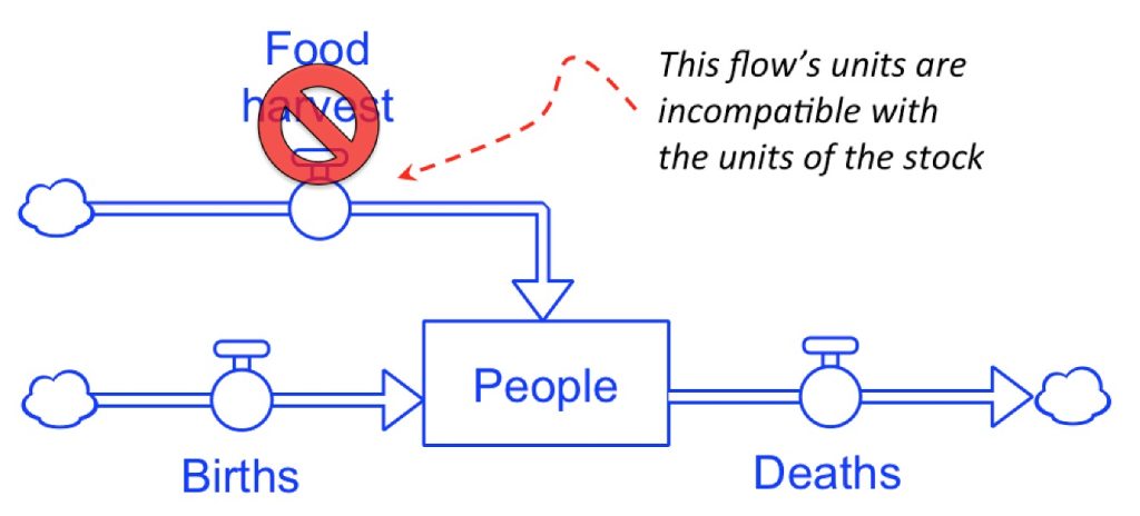
Can you see the problem with Figure 2.13? The Birth and Death flows can easily be expressed in terms of people per year. On the other hand, the Food harvest inflow is confusing. Since it flows into the People stock it has to represent some number of people added per year. But that does not appear to be the case. The name of this flow suggests that it represents the size of a crop harvest (probably measured in something like “bushels per year”). But “bushels” are not the same thing as “people,” so the units of this flow and its associated stock are not compatible. In fact, the logic of this model is suspect because food does not directly create people (as if “12 bushels of corn per year converts into 1 person”).
It is true that the size of a crop harvest will undoubtedly affect the size of the population, but not in way shown in Figure 2.13. Instead, the effect of food on the People stock is indirect; the food probably affects the stock of people by affecting either the birth or death rates (or both!). Later we’ll learn how to account for indirect effects such as this. For now, the important point to remember is that the units of a stock and its associated flows must be compatible. The flows must contain the same “stuff” that is stored in the stock.
Exercise 2.9: Team Modeling Activity – Determining Units for Stocks and Flows
- Refer back to the stock and flow diagrams you created in the previous Team Modeling Activity: Stocks and Flows All Around (exercise 2.8). For each diagram, specify what you think are reasonable choices for the following (the choices will vary from one diagram to the next). Be prepared to explain your choices.
-
- An appropriate time unit
- An appropriate unit for measuring the “stuff” in the stock
- An appropriate time unit for measuring the “stuff” in the flows.
- Imagine that you are considering different time scales for your model. Also assume that the numeric value for the contents of the Beavers stock in Figure 11 stands for the number of beavers in the population. Suppose that 20 beavers die and 21 beavers are born every year. What would be the numeric values and the units of measurement for the Beaver Births and Beaver Deaths flow if time is measured…
-
- in days?
- in months?
- in years?
- in decades?
- Now think about the Kaibab problem. Draw a stock and flow diagram with the following stocks and associated flows from the Kaibab Plateau. Assume that time is measured in years. Specify in parentheses the units underneath the name of each stock and flow. Add any causal links (and polarities) that you believe exist between each stock and its attending flows. Identify any feedback loops and label with R or B notation.
-
- Stock: Mule Deer Population
- Inflow: Deer Births
- Outflow: Deer Deaths (apart from predation)
- Outflow: Deer Killed by Predators
- Stock: Livestock population
- Inflow: Livestock Births
- Outflow: Livestock Deaths (apart from predation)
- Outflow: Livestock Killed by Predators
- Outflow: Livestock Sold or Moved Elsewhere
- Stock: Predator population
- Inflow: Predator Births
- Outflow: Predators Removed by Hunters
- Outflow: Predator Deaths (apart from hunting)
- Stock: Vegetation Food Supply (measured in calories of food)
- Inflow: Vegetation Growth
- Outflow: Vegetation Dying (via natural plant life cycle)
- Outflow: Vegetation Eaten
- Stock: Mule Deer Population
Examine the stock and flow diagram from the previous question and think about how the stocks influence one another. Add some causal links to show one feedback loop involving the interaction between two of the stocks. Label your loop and give it a descriptive name.
- Tefethen, 1967. Ibid ↵
- If you look in the system dynamics literature, you will find many diagrams like Figure 1.1. In some cases, the authors use “+” and “-” notation to label the causal link polarities. In other cases, the authors use “S” instead of “+” and “O” instead of “-.” The meanings of the polarities are the same with both sets of notation ↵
- This is a fictional story, that is founded in real-life examples that have been described and studied by economists for several decades. For one recent analysis of rent controls in San Francisco, see Diamond, R., McQuade, T., Qian, F (2019). The Effects of Rent Control Expansion on Tenants, Landlords, and Inequality: Evidence from San Francisco. ↵
- This problem is adapted from Sterman (2000). Business Dynamics: Systems Thinking and Modeling in a Complex World. Irwin McGraw-Hill. ↵
- Ford, D. N. (2019). A system dynamics glossary. System Dynamics Review, 35(4), 369–379. https://doi.org/10.1002/sdr.1641 ↵
- See the National Geographic Article “The Big Idea: The Carbon Bathtub” at http://ngm.nationalgeographic.com/big-idea/05/carbon-bath for a vivid description of the stock of carbon in the atmosphere and the associated flows that impact that size of that stock. ↵
A collection of interconnected things that together operate toward a certain end.
Refers to changes over time.
A graph with time on the x-axis and the variable on the y-axis. The intention is to capture how the variable is changing over time.
An arrow between two variables indicating causality. In System Dynamics, we are making the argument that the variable at the tail is causing the variable at the head of the arrow to change.
Link polarities are either plus "+" or minus "-". A plus "+" indicates that the variable at the head of the arrow will move in the same direction as the variable at the tail. The minus "-" indicates that the variable at the head will move in the opposite direction as the variable at the tail.
A change to any variable in a balancing loop will work its way around the loop and reduce the initial movement. Balancing feedback loops will result in a steady state, equilibrium or some type of balance, if given enough time.
A change in any variable in a reinforcing feedback loop will work its way through the feedback loop and result in additional movement in the same direction. A reinforcing feedback loop is also know as a positive feedback loop.
A behavior over time graph would show no change indicating the variable is in equilibrium. If this is a stock, there could be movement meaning that some stuff is flowing in at the same rate as it is flowing out. In equilibrium, of a stock, the inflows equal the outflows.
See equilibrium level. They are the same.
A balancing feedback loop is always working toward some goal. These goals may be explicit (clearly stated) or implicit (not clearly stated or known). The behavior over time of the any variable in this loop is working toward some steady state that value of which equals the goal.
Things that accumulate in a systems. They can be physical, population, or information, about something, the morale of an organization. Stocks are only change by flows.
The movement of things or information into and out of a stock. Only flows can change the amount of things in a stock.
A visual representation of the accumulations (stocks), rates of change (flows) and other variables (auxiliary or converter variables) in a model.


Feedback/Errata